
Throughout my career in digital design, I’ve worked on countless online advertising campaigns. And yet, one question has always lingered in my mind: do banner ads actually work? Personally, I never click on them. However, I do acknowledge their value in terms of brand awareness and visibility—provided they’re strategically placed on sites that people actually visit and the cost of serving them is justified.
What I’ve consistently struggled with, though, is the common practice of taking a single piece of artwork and applying it across multiple ad placements without considering how it should be adapted for each format. This becomes especially problematic when it comes to mobile advertising.
The Challenge of Mobile Banner Ads
While mobile devices have evolved—boasting larger screens and improved display resolutions—industry-standard mobile banner ad sizes remain relatively small:
• 320x50 (phone banner)
• 320x100 (large phone banner)
• 300x250 (medium rectangle, used on both phones and tablets)
• 468x60 (tablet banner)
• 728x90 (leaderboard banner for tablets)
• 320x100 (large phone banner)
• 300x250 (medium rectangle, used on both phones and tablets)
• 468x60 (tablet banner)
• 728x90 (leaderboard banner for tablets)
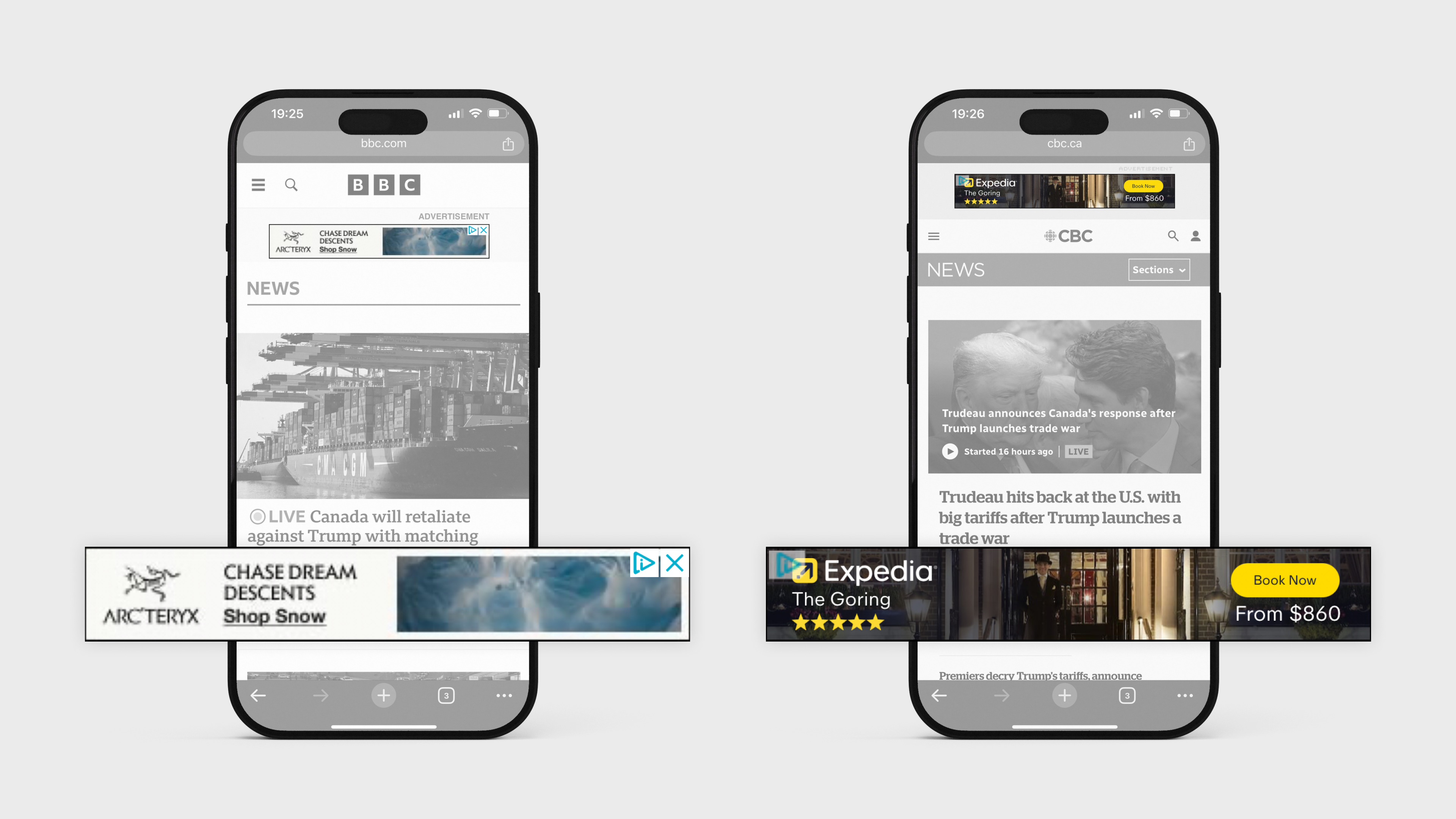
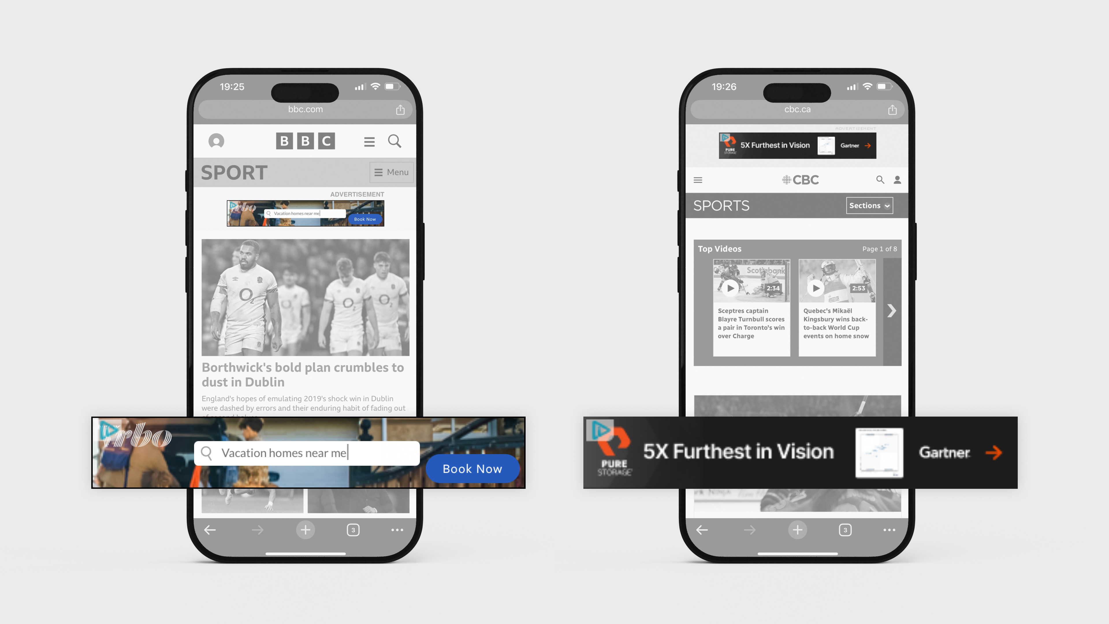
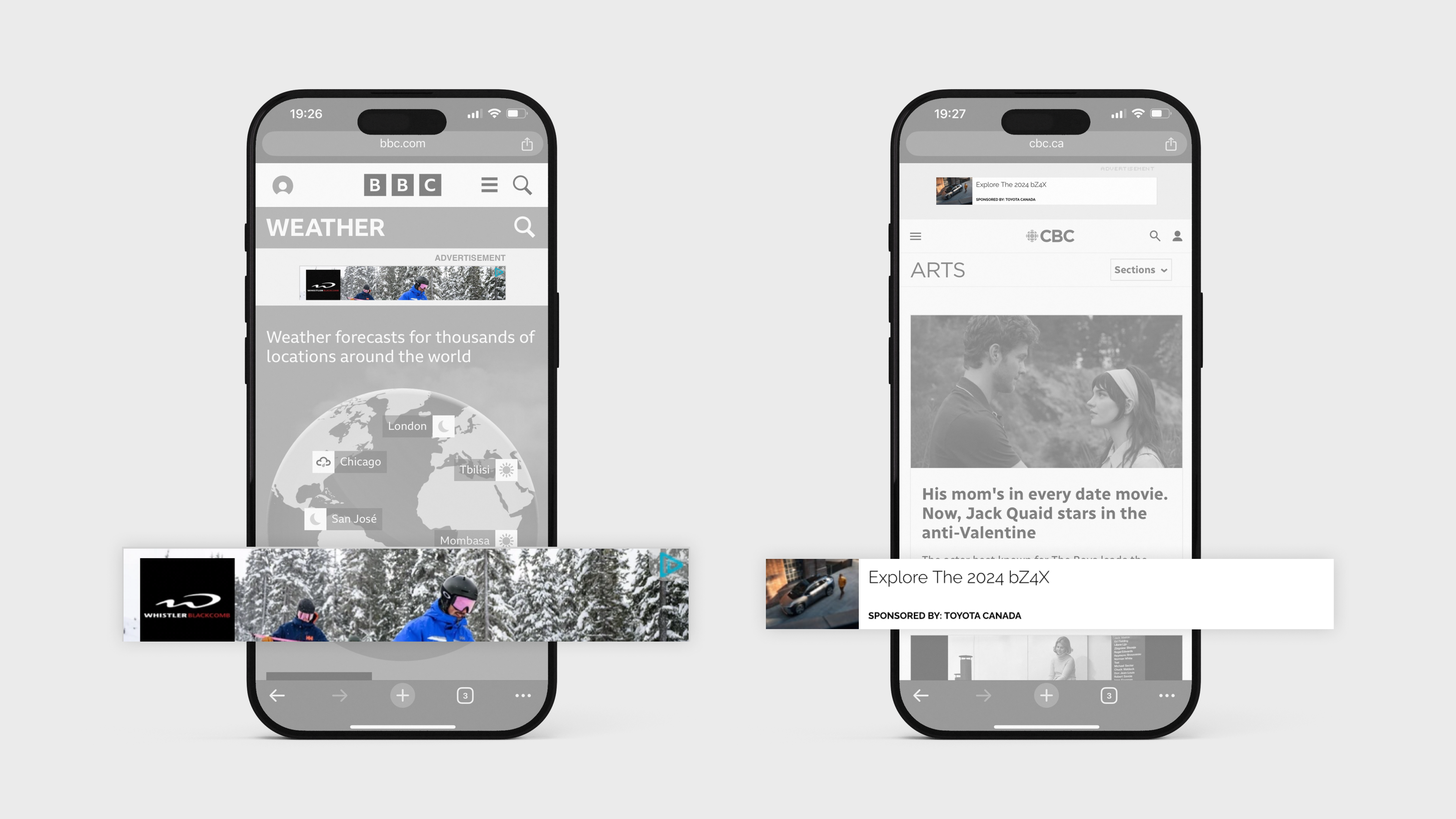
Given these dimensions, why do clients still insist on using complex imagery that becomes so small and poorly cropped that its purpose is entirely lost on users? The worst offenders are those who demand product shots in a 320x50 banner, where any image becomes virtually unrecognizable.
A Battle Between Design and Client Expectations
For years, designers (myself included) have tried to steer clients toward simpler, more effective designs. Our recommendation? Stick to text-based ads that maximize branding and messaging clarity. Unfortunately, this suggestion is often met with resistance. The response is nearly always: "We have to include the product in an image."
The problem? By cramming an image into an already tiny space, not only does the product become indistinguishable, but it also limits the space available for branding and key messaging. The result? An ad that is both visually ineffective and functionally useless—essentially a wasted investment.
Do Media Buyers and Clients Consider Real-World Execution?
I often wonder: do clients and media buyers ever look at the final deliverables in real-world situations? If they did, surely they would recognize the flaws in their approach.
A well-designed mobile banner ad should prioritize:
1. Legibility – If the text isn’t readable at a glance, the ad fails.
2. Simplicity – Cluttered designs are ineffective. Minimalism wins.
3. Brand Presence – A clear logo and concise message outperform unnecessary imagery.
4. Adaptability – Designs should be adjusted per format, not forced into a one-size-fits-all approach.
Opening the Conversation
I’d love to hear your thoughts on this. Have you encountered similar frustrations? What do you think drives the insistence on using images in tiny banners? Let’s discuss some potential compromises that could improve design and, ultimately, marketing success.
Feel free to reach out to me if you’d like to continue the conversation!